Wednesday, May 6, 2009

bright pink shoes for my bright pink future

MY WEEK'S WORK: 

1) First, I finished my global journalist design. The whole experience was definitely a learning experience. When I got the assignment and my pieces for the design, my editor and I were in completely different places. My editor had no idea what was going on at all. Thank goodness for Aimee. My first design was completely different from the second because the photo they had given me for the lead could only run super small. So after the editors realized that then, they understood my first design a little better. Aimee and I met to discuss more photo options and worked out all the issues. Thanks Aimee! 

2) Pets issue comes out tomorrow!!! YAY!! Everybody pick one up! I think it looks great. I am just so excited to see it. The other designers and I have been so involved with this thing since the very beginning and I feel like more than any other piece I have done this semester, this one is our baby. Here was our template example. I'll put up photos of my department and feature soon. 


RESPONSE: 
We had our presentations with the lovely people from Meredith Corporation this week. I think they all went really great! They liked our magazine and were happy with the design and ideas we all had. I had a great time talking with them about our product and about the business in general. They had a lot of great things to say. I had absolutely a great time making Mix and I am very thankful to them and the time they gave us. 

IN THE DESIGN WORLD: 
I read on a design blog that Steven Meisel has shot every cover of Italian Vogue for over the last 20 years. His 317 covers to date can now be found in a book. What a fun book to have. And what a feat!
 

Wednesday, April 29, 2009

My Running Shoes

MY WEEK'S WORK:

Well I have to say this week kind of feels like finals week to me. Not a moment to breathe but I have to keep running. I know we have two weeks left of school after this one but, this is my power week. Currently I am writing my last research paper of my undergraduate career and I have to say, it feels lovely! Well, not writing it, but seeing the end in sight. Yay! 

However, in my design world...

1) My biggest project in the past two weeks has been my website. It went through three redesigns and a server crash but somehow made it out on the other end. It feels good to have accomplished that. I had never worked with any kind of web before so I was proud of myself for what I did. I feel like my home page still needs something to spice it up some more but I am happy with the rest of it. Web is definitely different from print in so many ways. It's very interesting. While my preference is print because that's where my heart is, the web feels like this whole new world for me that could be fun to explore some more. 

2) Mix went to the printers! Yahoo! However, this week I designed a mock cover for the publishers' media kit. I really liked how it turned out. They wanted the focus to be on food but somehow still go with their main feature story sell line they gave me. I think this one worked well. I had a lot of fun with it. Now we're all gearing up for our presentations to Meredith Corp. Our presentation is on May 5th and while it seems like a lot of people were nervous, I think I am just more excited. We have lived with and created this magazine and I am happy to present it.
 

3) This week I am currently working on the Pets Issue and Global Journalist. My first design of Global Journalist is due Friday and production of the Pets Issue is all weekend. I am very excited for both. The story I have is a serious one for GJ and then the Pets Issue is the exact opposite so it will be great to kind of work on polar opposite things.

Our style guide is done for the pets issue but Julia and I need more text before our feature on pet boarding can go any further. I really like our style guide. I think we came up with something fun and playful that isn't elementary. I'll share pictures next week! 

RESPONSE:
My response is more of an irritated rant. Where the heck did this swine flu come from and why is it necessary?? I was supposed to be leaving for Cancun the day after graduation and now, not so much. Stupid flu! Any ideas of where I should go instead?

IN THE DESIGN WORLD:
I was browsing the net and I found on magculture this comparison of before and after Interview flags from one Art director to another. I thought it was really interesting to see two different takes on the same magazine. I like the current one much better, but I thought it showed an interesting transition. (The first one is old, the second is current.) 

DESIGNINGMAGAZINES.com:
Well after watching this blog the entire semester there has not been one new post. I'd say it's safe to say you can take this one off of your list Jan. However, I went back and saw these really great spreads from New York Times Magazine. I know they're older but I love them. They just have such strong and fantastic concepts. I like. 

Wednesday, April 22, 2009

bare feet

MY WEEK'S WORK:

1) This week we have been finishing up MIX. YAY!! I have to say I am happy with the finished product. I was more than ready to see it leave my hands after all the hard work we put into it, but I will be excited to see the finished product come back to me. It's pretty amazing to me that Lauren, Aimee and I designed an entire 52 page magazine. I am excited! Here are a couple of the finished pages that I did! 

2) I have also been hard at work at reworking covers for the Art of the Encore feature. We were thrown for a loop when we had no photos in for deadline, but I worked a cover out with a stock image and then made another one once we got the photos in. Meredith had given us the option of choosing covers for different stories, but I stuck with this one because I felt it was the most visually stimulating. Plus I am obsessed with live music, so it inspires me more than a news story about how movies are making lots of money. Here are my redesigns.

3) Also this week I have been working on Art Directing the May 7th pets issue for Vox. We're blowing up the issue into a themed issue and so the feature designer's and I get to completely redesign the whole issue. I think it's going to be a fun piece for me to end my year on. The theme is "Vox Unleashed," and our entire inspiration has come from the idea of being unleashed. I'll put something up once we've worked on it a bit more. We have a little template ready but it still needs a bit of fine tuning. I'm really excited to get to be on the Art Direction side of things. I feel like it's another great experience before I graduate. 

4) Lastly I have been doing my website this week. The server isn't being my friend and I have redesigned it 3 times in 2 days. I got in one of those moods where I hated everything that I was doing. I think I just got so frustrated I wasn't allowing myself to think creatively anymore. I feel like I've crawled out of that rut now spending a day away from it because I had a lot of other things to do today. Tomorrow I will be back at it and hopefully with more success! :0)

RESPONSE:
I watched SSND judging this week and it was really interesting. It's really fun to hear what professionals have to say about your peers' work. It showed me no detail is too small or too big. Pieces were thrown off of the table for overall macro mistakes and also for the smallest micro mistakes. Although I guess that is to be expected when it's a contest but it just showed me how important it is to make sure and look at the details and the overall larger theme every time. 

IN THE DESIGN WORLD:
I was searching this week for some inspiration for my website and I found a site that listed a ton of sites as the design trends of 2008. They were all different sites made for different reasons and I thought they were fun to look through. It had my favorite feel to it. Check it out and pick out your favs. 


DESIGNINGMAGAZINES.com
Again no new posts. I think we can sufficiently say since I have not seen a new post all semester that this man has given up his blog. Oh well. I went way way back in his blog and found him talking about Bon Apetit's redesign. Because I have been designing for a cooking magazine now for the last semester I have been paying attention to more food magazines and this by far is my absolute favorite! It is quite gorgeous. Look at his cover example. YUMMY! 


Wednesday, April 15, 2009

nothing but ballet flats this week-so they don't touch my new tattoo

MY WEEK'S WORK:

Well right now the work most prominent in my foreground is MIX. We had our first meeting with all the pages printed out on Monday and then the other designers and I had a crunch night that evening to get the style choices all on the same page. So the pages I have done to share right now are a couple of simple department pages but they can show at least the style decisions we have made. I have to say I am happy where it is going. I know there has been frustration between designers and the publishers but overall I have been happy with the process. I just think we had to learn to try and speak the same language. I think it's hard for non-visual people to communicate what they want and it's sometimes like we spoke different languages. But I thought it has been interesting to work with new designers I had never worked with and also with the publishers to all come up with this prototype. Here is a small taste of what I've been doing and where we are headed:
During the rest of this week I will be finishing my MIX feature and last department, so I'll put those up this weekend. My cover group was also supposed to be doing covers this week but the photo editor didn't want to give us the photos she had because she said they weren't cover worthy, so as of now we're on hold.

But the most important this weekend will be my website. I am going to buckle down and completely revamp it. I'm really excited. I feel like I am slowly but surely understanding more of the web and I want it ready and working so I can start sending it out to hopeful employers! Yay!

RESPONSE:
I got a new tattoo on Monday! I had been wanting to get something in Columbia before I graduate because my time here has been a great time in my life. I feel like I've been doing a lot of self reflection lately because I am about to leave and I have to say college couldn't have gone better. I feel like I succeeded in my collegiate career and had fun at the same time. I fell in love with graphic design and found something that truly makes me happy. I got engaged with the love of my life. I have the best friends a girl could ask for and in the last semester have met and become friends with some other great designers who are about to take over the world this May. 

Well enough of that sappiness! Still have to get through the next four weeks before I can get too sentimental. ha Either way I got a new tattoo by a lovely woman named Roxane and I think it's beautiful. This is a picture from the day I got it. (Oh yeah, explanation, I got engaged at the Blue Note. Get it? Blue Music Note. ha ha)

IN THE DESIGN WORLD:
I found this site that had really great examples of fun and creative Error 404 sites. You know the annoying "site not found" message you get. I am looking for any web inspiration right now because I am trying to do my own website and also have been talking with a friend who wants me to design a website for his custom frame business. Since I feel like I am just learning the web I need all the inspiration I can get. I thought this was a fun way to look at inspiration from a site that you wouldn't even have to put anything on. I thought this one was super cute. Check out the link to see more.


DESIGNINGMAGAZINES.com:
Well, apparently this blog is having technical issues this evening because it won't come up on my computer. I'll keep checking and keep you updated.


Wednesday, April 8, 2009

i need some dancing shoes

MY WEEK'S WORK:

1) This week I have been working non stop on Meredith. Our final designs are due to the publishers on Friday so I've been designing for that with every free moment I have. I think this whole process has been a good learning experience because it's a good example of what happens when 5 people are telling you what they want and they want different things. I was very glad that we had our meeting last week with all the publishers because it made us all get on the same boat of where Mix is going. Amy, Lauren, and I have been working together this week on style issues and it seems like things are coming together nicely. I will be excited to see our final prototype. Here is one of my redesigns from a department I showed you last week. 

2) I also did the department for the Arts this past weekend and an evergreen for the department as well. I am not sure if I really feel like I am getting a ton better about departments. I feel like the last photos I have been given were better quality so that is good, but there haven't been any stories that required any illustrations or anything other than a photo request. I don't know how much growth my departments will show over time, but I guess we'll see.

RESPONSE:
Yesterday in class a few of my colleagues reported about conversations they had with designers in the industry right now. I have to say it didn't really help me, it just made me even more nervous than I already am. The thing is that I am not nervous about getting an entry level position, I'm not nervous about working hard, I am nervous that no one will give me a chance. I am worried that I'll have spent this time falling in love with design and then I won't get to do it. I'll have to find a position doing something else so that I can pay the bills. I just don't want to have worked this hard to get into a job I don't like at all.

Although, I think one really good thing that every person said was that you need to make sure your portfolio is diverse. I need to make sure when I put everything together that it shows all the different things I can do. 

IN THE DESIGN WORLD:
This isn't exactly related to design but FOLIO just put out their annual list of the top 40 magazine industry influencers and innovators. As opposed to all of the dark and sad stories about magazines closing, I thought this article gave a little light at the end of the tunnel that some people are still succeeding. YAY!

DESIGNINGMAGAZINES.com:
On an entry a very long time ago the blogger puts this photo up with the caption "Ok, it's settled. There is no appropriate use for Papyrus." I have to say I agree 100%. I think it is a font made for birthday cards or postcards, not for magazines. 


Tuesday, March 31, 2009

from sandals to snow boots

MY WEEK'S WORK:

Wow. I can't believe I was away from you for a week miss blog. I missed you greatly. But here I am! Back in full force!

1. Right before spring break I had covers due for Vox about a play which discussed what women want. I have to say this was probably the most I have struggled with any of the projects or pages for Vox all semester. I know part of that was purely because of the timing but, also part of it was I think I had trouble trying to match a decent headline with the picture and make it all look cohesive. Here are my two favorites from that batch:

2. This week and during spring break I also have been working on our Meredith prototype. I really like the way our designs are looking and I have had fun challenging myself working with departments with a lot of little details that need to look cohesive. I have had a lot of fun doing these pages though. I think our only issue as a whole is there are some major communication barriers between the designers and the publishing group. I feel like we're hearing different things from all the publishers about what they want and it seems contradictory. So this is the way we're headed as of now, but in the meeting tomorrow that might change. 

3. Also this week and over spring break I have been working on the first edit of my website. Today in class I gathered critiques from my classmates after my presentation and I can't tell you how helpful they were. I think my first edit of my website was so much me just trying to become comfortable with Dreamweaver that now I feel like I can go back in and spice it up a little. All of my colleagues comments really helped because this is my first try at any sort of web design so I will take any help I can get! It can get really tense for me working with web but, I want to learn especially so I am at least knowledgeable for when I start looking for jobs. 

RESPONSE:
I think my response this week will have to be about my spring break trip. I went to Panama City with four of my friends. For living in a land lock state, I am the biggest beach bum I know (minus my Mom). I love the ocean and the way it makes me and any of the stresses I have feel small. I think it gives me perspective. Not to mention it calms me. All of the senses. The sound of the ocean, the feel of sand between my toes, and the distinct color of blues (my favorite color) as you look out into the gulf. Walking along that beach every morning was exactly what I needed to calm me and rejuvenate me to get through this last push to graduation. Not only was beauty like that inspirational to my heart, but also to my future work. Here are a couple pictures off of our balcony.

IN THE DESIGN WORLD:
So a couple of posts ago I discussed an issue of Teen Beat with 3D posters included of the Jonas Brothers. Then what to my surprise over spring break when I pick up the latest issue of Entertainment Weekly and flip a page immediately to a tear out pair of 3D glasses. Following was several pages with 3D photos of the upcoming animated films. Also in the middle McDonalds got into the action with a 3D ad of a hand holding a Big Mac protruding out at you. 

I think it's funny to see what one magazine does then several more pick up. As a designer I think it's a fun way to make your designs interactive. I am sure they had fun working on a new idea like this. I would have. I just think it's fun and rather funny that one of the trends in entertainment magazines right now is a trick that has been in books and movies for years. I like it! 

(Plus, as a fun extra for me, Paul Rudd was on the cover and I LOVE him.)


DESIGNINGMAGAZINES.com
Well WAY back on my blog the blogger referenced his teaching page and I clicked on it. As an addition to his blog he has a page on books and tips for those who are teaching design. While obviously I am not teaching design, and just learning, I still found it interesting. It had some good tools: articles of interest, a few magazine profiles, etc. Check it out if you're interested.

Wednesday, March 18, 2009

packing up my flippy floppies

MY WEEK'S WORK:

1. I am once again working on covers this week. There was a mix up with the last cover story and apparently that story is not being done so we were asked to do covers again this week. I have 3 done but I am not yet sure that those will be the 3 I turn in so I am not going to put any up yet. I will do that next week once I know which three I turned in! 

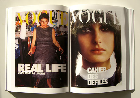
It's been a good learning experience because it has been the first photo cover story we've been given this semester. Everything else has been photo illustrations. It has definitely been a challenge because the photos came back grainy and a little hard to work with so we've been creative freedom with editing photos, which usually isn't given. I am trying to come up with something content driven, not just something I played with in photo shop to make pretty. So we'll see how it all turns out! 

2. My Meredith project group met this week and made some decisions on our style guide. I think it is coming along great. I am working on the logo this week because we are still tweaking that a bit. I'll put it up when we have our final. 

3. I am redesigning 3 of my logos for Show Me Dharma as well. The class all voted on each others and which ones to redesign and it was pretty unanimous on which ones everyone thought I should design so that decision was made for me! I think I already know how they need to be changed as well, so I am excited to turn those in on Friday.

RESPONSE: 
I realized this week that this class has made me so much more aware of what is around me. It makes me notice things about design and the world around me that I never would have thought of before. I was watching one of those cheesy commercials about the shot Gardasil and at the end the logo for the drug flashed on the screen and I thought, oh, I don't like that at all. But then as I looked at the circles above the dot on the eye I thought to myself, well they were probably trying to get across the idea of protection. Of it guarding you if you'll get that shot. 

Then all of a sudden I realized, here I was in my own house, by myself, dissecting the logo of an anti-cervical cancer shot. I need a life. ha ha. No, what I really realized is exactly what I am saying. This class has made me so much more aware of paying attention to the small things because I realize now that there was some designer behind it who dissected the idea of those circles for hours before coming to the final design. I like knowing that. I feel like an insider. 

IN THE DESIGN WORLD:
Kelly McMurray on folio wrote a blog this week on 5 design tips that don't cost a thing. I thought it was a very interesting entry because everyone is looking for good deals on how to do things cheaper in this economy. That includes designing. One of her tips is to play with type and find typographic solutions to your problems. I thought that was a good tip and something I am trying to work on a lot.

DESIGNINGMAGAZINES.com
On my blog this week there once again was no activity but I found an old entry where he talks about suggesting some books on design to be read. I found after the discussions and readings in this class how much books actually help. I didn't realize I could really find help for me and my art in books. Art seems so subjective and something you just do and feel, but these books really have helped me. Here is his list. Our required design book for this class is on there!


Wednesday, March 11, 2009

clicking my heels together in preparation for spring break

MY WEEK'S WORK: 
1. On Monday I met with my Meredith group and we made a schedule for ourselves and divided up the work a bit. We are all going to come up with concepts for our style guide and meet next Monday. I am excited to finally really get my hands on this project. I am also excited because I can tell it's truly all going to be a group effort and the decisions we're making is all together. 

2. We were told on Tuesday that our cover ideas had changed so between yesterday and today I came up with covers for the photo essay about women in stereotypical men's jobs. I have to say I was much more excited about this cover instead of payday loans. I had a really good time designing these covers. Here they are:
I really tried to listen to what Jen and Meredith have been saying in class about covers and how the text needs to be big and bold, the image needs to be eye catching and easy to understand quickly. I hope I achieved that. I think I did, however, I do know I always get an entire new point of view when they get printed out and others look at them. So we'll see tomorrow! 

3. Also this week I worked on logos for the organization "Show Me Dharma." It was the first time I have ever really worked on a logo and I think some of my images and worked and some of my ideas were to involved to work for a logo. I am definitely still learning about how to design a logo. Here are a couple of examples:

RESPONSE:
In class on Tuesday we talked about our creative process. It was really interesting to hear how everyone comes up with their own ideas. I think what struck a chord with my the most though is when Kristin was talking about over analyzing everything. I do the same thing. Especially with my design work. I am not completely confident yet in my work. I mean I believe I am a designer and I have talent but as far as being completely confident, I am not there yet. Because this is something I am so passionate about, I over analyze it so much. I over analyze what people say about my designs and I go over and over again the decisions I make. Especially during the design process. But like Jan said, how much analyzing is too much? When does it help and when does it become a hindrance? I don't think I know yet. 

IN THE DESIGN WORLD:
I found this series by Matt Siber called floating signs.
I thought it was a really interesting series that made some pretty photos. Also I think it's kind of funny that it puts these normal signs and icons in almost a Godly sight. It gives the companies a different kind of image, that is for sure. 

DESIGNINGMAGAZINES.com
In one of his old posts he talks about the magazine called Remarriage. 

I thought this was interesting 1. because it is such a niche topic but 2. it caught my eye most of all because of the logo. I thought this was a great example of a logo that had played with the type in a fun and smart way. Sometimes I have trouble coming up with subtle and attractive ways to play with type so I like finding fun examples. 


Wednesday, March 4, 2009

life in my black chucks this week

MY WEEK'S WORK:
Well, I have to say this has been the first week of the semester I haven't had anything due in this class that I am working on. So I pretty much have taken the week to try and catch up on my other classes. Reporting, midterms, papers, etc. They all seem a little arbitrary being only 2 1/2 months away from having to find a job. But, I guess to get there I need to graduate, which means finishing my other classes as well as doing work for this one. 

However since I have made myself work on other things this week, I feel a little deprived of design and have been conceptualizing my website and logo as I walk around campus. It looks great in my head, so I now I just need to move forward on the computer. 

RESPONSE:
In class on Tuesday Phillip gave a presentation on Playboy and I thought it was really interesting that they tried to put the bunny logo on every cover. I had never noticed that before. I mean I don't often look at Playboy but the logo is so iconic and is on anything and everything these days. They definitely succeeded in making that the real brand of their company. I know putting it on every cover had a huge part of making it so important to the company. Especially using it in fun and creative ways. Just like the photo Phillip showed where it looked like they had drawn it in fireworks. 

I think this kind of household branding is something that every company tries to achieve and whether you agree with the actions of the Playboy company or not, you have to give them props for making a bunny head this iconic.

IN THE DESIGN WORLD:
I was looking on some FOLIO blogs and I found this article about Tiger Beat. Which I know obviously this isn't a magazine that all of us probably read all the time but in their last issue half of the magazine was 3D. I have to say, Tiger Beat and all, that is pretty cool. For their target market I thought it was pretty ingenious. The little 13 year old girls that pick up that magazine will just die when they get a poster of the Jonas Brothers in 3D! I feel like in the print world we are all having to find new and creative ways to do what we do so that we can compete with all the other mediums out there. This, I thought, I great example for Tiger Beat. I mean they include the 3D glasses in with the magazine! 

Try to tell me if you were 13 you wouldn't love it!


DESIGNINGMAGAZINES.com
I still haven't seen a new post from my blogger, but I went back in his files and saw an entry about a cool cover. 

I thought this was such a great photo montage. If I saw this in a store I would definitely pick it up. The blogger made some remarks about how could the magazine actually be fast coming out only 4 times a year. That I don't really care about because I was just admiring the art on the cover. I thought it was fun and lovely. I like!


Wednesday, February 25, 2009

i broke out my flip flops today--beautiful!

MY WEEK'S WORK

1) Here is the B&B Feature final copy from last week's Vox. I was very happy with the way it turned out. I think it will make such a great portfolio piece for me. According to yesterday's critiques the class thinks so as well. This was the piece in my portfolio that had the most votes over anything. I think it was a great learning experience about organizing a lot of lists and material. I'll take a lot away from this experience. 
2) The second thing I was really working on this week was my Meredith stuff. I am working on a team called Mix and the publishing group's idea and point is to be energetic and exciting to the young and new cook. It's supposed to be a magazine for all cooks of all different skill levels. I tried to take as much from their mission statement and turn it a good design. Here is the designs for my presentation that was presented on Monday. The publishing groups still hasn't made up their mind so who knows what their thinking! haha

RESPONSE:
I don't want to be an editor. Let me say this again, I will never ever ever be an editor! EVER! Just purely taking that editing test made me want to poke my eyes out. Worse than writing. At least there is a part of me that enjoys a specific kind of writing. However, editing, do not care, do not want to perform ever. I will be the happiest peach in the entire world if you will give me a lovely written/edited piece to make look beautiful on a layout for, but please don't ask me to edit it. EVER! 

However, in my rant about how much I hate editing I would like to say how great of a professor Jennifer Rowe is. I can say that without ridiculously brown nosing because she doesn't read this! But I would like to send out into the world that even though I hate the subject, if I were ever to teach in my future, I would hope to be as great as a professor as her because however awful the subject is, she is dedicated to the subject and to her students. (I am sure that had comma errors in those two paragraphs but I DON'T CARE!)

IN THE DESIGN WORLD
I wasn't certain what to write about this week because I hadn't come across anything specific to write about in the last week. So, literally I went to google and typed in "new design." This site came up called "new design".

So I started searching on it and on the home page is a bunch of images of designed beach huts. It says above it that in their 63rd issue they asked for a bunch of people to design a simple beach hut and this is what they came up with. I thought it was a fun example about how every designer could be given the same task and each one would come up with something different. Very cool. Very interesting. 

DESIGNINGMAGAZINES.com 
So once again my blog has not written anything new so I decided to once again look back into it's old posts. I came upon an entry about the Steven Colbert cover of Esquire. He made some snide remark about how in Esquire's 75th year they are intent on proving that they are not as good as they used to be and this cover says it all. I have to say I highly disagree. I like this cover and I think it is a great satire. It is fun and plays on the old cover which I think is great. I don't know, Maybe I am not as good as those high and mighty critiques who think they're the kings, but I like this! So boo them!  What do you think? 


Wednesday, February 18, 2009

even the soles of my uggs are starting to get thin

MY WEEKS WORK:
1) Well Sunday I finished (mostly) my first feature for Vox. Meredith and I did some more work on it over the week but I unfortunately forgot to go get the final product off of the server, so the photo will come a little later. I had a lot of fun designing it and am happy with the way it turned out. It's crazy to me that five weeks ago I had no published clips and now I have three or four. I love it.

2) Monday I met with Jan and talked about my ideas for the Meredith project. Here are my first ideas of logos and first attempt at a cover. The logo on the cover is the basic concept I am going to go with, but minus the fork and knife. With those two it is all too literal, which I think a lot of my logo ideas were because that is first place I go. However, I have specific vision now and I am excite to work it out this weekend. 

3) Tuesday I gave a presentation on Allen Hurlburt's time at Look magazine. 

This was by far my favorite spread. The way he used these images on this spread were pretty fantastic. I don't think most people would pick that picture to be the dominant photo and then also run it that big, but it looks stunning. It tells the whole story with the other pictures on the side and is very aesthetically pleasing. 

4)I am also in the cover group this week and turned in my first edits of the "Best Time to do Stuff" cover. It was a little hard at first to come up with ideas but just tried to sent down and create a different cover each day. I wanted to try and make three different covers because the last time I presented my first edits were all pretty similar. Obviously there are similarities but I think I did better this time with my first edits. We'll see what they say tomorrow afternoon. 

5) I am also working on my website but don't really have much to show for it. It's been one crazy crazy week and to be completely honest I having some serious creative block. I don't know what direction I even want to go with. I think my mind has been so cluttered this week I haven't even been able to give it real thoughts. I'm most of the time a glass half full person, fun, and bubbly. I want to be able to speak that through my website without it looking little kid-ish or immature. So that is my current state. 

RESPONSE:
Before each person in class gave their history presentation this week, Jan asked us all to say our full names and what we want to be when we grow up. It was great to hear everyone's answers. It's funny to realize that even though we all say we want to be graphic designers, there are so many aspects and careers with in our field. While most said they wanted to be a graphic designer, each said something a little different on top of that every time. Me, personally, I am not sure how to label myself. I don't think I have got it all figured out yet. The only thing I do know is that I am thoroughly enjoying designing for a magazine and if someone would like to pay me to do that, LET ME KNOW! I am in!

IN THE DESIGN WORLD
Well it might be a little repetitive to speak about accessories again in the my design world section, but I have a timely reason. Last weekend for Valentine's Day my fiance got me a new purse. I was very impressed by his choice and I was thrilled. I don't have the money to buy fun things like this for myself. The design of the purse is fun, sexy, loud, lovely and bubbly. Good decision Matt!

Once again there are no new posts on his site but I went back a few posts and found this magazine joke...

Did you hear that Maxim and Yoga Journal had a baby?


bud-dum-shh! hehe