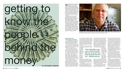
Here is my redesign of my economy spread. I thought my first attempt seemed pretty bland but I found this new image that seemed bold and loud and I liked that. It seemed like it had to do with the theme of money but was a little louder which seems to match more of the Vox voice. There are so many economy stories out there right now that I think image selection is very important. Images are the first things that people look at when they open the page, so I wanted to make sure I had an aesthetically pleasing photo that can also speak the feeling I'm going for.
Monday, February 9, 2009
Subscribe to:
Post Comments (Atom)


No comments:
Post a Comment