Wednesday, February 25, 2009

i broke out my flip flops today--beautiful!

MY WEEK'S WORK

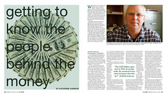
1) Here is the B&B Feature final copy from last week's Vox. I was very happy with the way it turned out. I think it will make such a great portfolio piece for me. According to yesterday's critiques the class thinks so as well. This was the piece in my portfolio that had the most votes over anything. I think it was a great learning experience about organizing a lot of lists and material. I'll take a lot away from this experience. 
2) The second thing I was really working on this week was my Meredith stuff. I am working on a team called Mix and the publishing group's idea and point is to be energetic and exciting to the young and new cook. It's supposed to be a magazine for all cooks of all different skill levels. I tried to take as much from their mission statement and turn it a good design. Here is the designs for my presentation that was presented on Monday. The publishing groups still hasn't made up their mind so who knows what their thinking! haha

RESPONSE:
I don't want to be an editor. Let me say this again, I will never ever ever be an editor! EVER! Just purely taking that editing test made me want to poke my eyes out. Worse than writing. At least there is a part of me that enjoys a specific kind of writing. However, editing, do not care, do not want to perform ever. I will be the happiest peach in the entire world if you will give me a lovely written/edited piece to make look beautiful on a layout for, but please don't ask me to edit it. EVER! 

However, in my rant about how much I hate editing I would like to say how great of a professor Jennifer Rowe is. I can say that without ridiculously brown nosing because she doesn't read this! But I would like to send out into the world that even though I hate the subject, if I were ever to teach in my future, I would hope to be as great as a professor as her because however awful the subject is, she is dedicated to the subject and to her students. (I am sure that had comma errors in those two paragraphs but I DON'T CARE!)

IN THE DESIGN WORLD
I wasn't certain what to write about this week because I hadn't come across anything specific to write about in the last week. So, literally I went to google and typed in "new design." This site came up called "new design".

So I started searching on it and on the home page is a bunch of images of designed beach huts. It says above it that in their 63rd issue they asked for a bunch of people to design a simple beach hut and this is what they came up with. I thought it was a fun example about how every designer could be given the same task and each one would come up with something different. Very cool. Very interesting. 

DESIGNINGMAGAZINES.com 
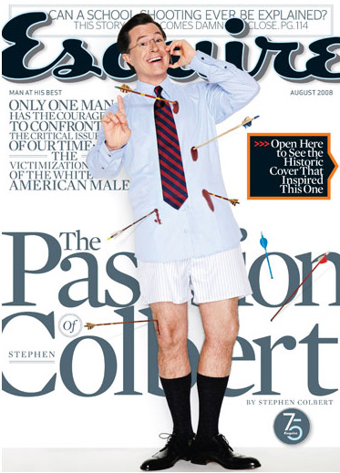
So once again my blog has not written anything new so I decided to once again look back into it's old posts. I came upon an entry about the Steven Colbert cover of Esquire. He made some snide remark about how in Esquire's 75th year they are intent on proving that they are not as good as they used to be and this cover says it all. I have to say I highly disagree. I like this cover and I think it is a great satire. It is fun and plays on the old cover which I think is great. I don't know, Maybe I am not as good as those high and mighty critiques who think they're the kings, but I like this! So boo them!  What do you think? 

Wednesday, February 18, 2009

even the soles of my uggs are starting to get thin

MY WEEKS WORK:
1) Well Sunday I finished (mostly) my first feature for Vox. Meredith and I did some more work on it over the week but I unfortunately forgot to go get the final product off of the server, so the photo will come a little later. I had a lot of fun designing it and am happy with the way it turned out. It's crazy to me that five weeks ago I had no published clips and now I have three or four. I love it.

2) Monday I met with Jan and talked about my ideas for the Meredith project. Here are my first ideas of logos and first attempt at a cover. The logo on the cover is the basic concept I am going to go with, but minus the fork and knife. With those two it is all too literal, which I think a lot of my logo ideas were because that is first place I go. However, I have specific vision now and I am excite to work it out this weekend. 

3) Tuesday I gave a presentation on Allen Hurlburt's time at Look magazine. 

This was by far my favorite spread. The way he used these images on this spread were pretty fantastic. I don't think most people would pick that picture to be the dominant photo and then also run it that big, but it looks stunning. It tells the whole story with the other pictures on the side and is very aesthetically pleasing. 

4)I am also in the cover group this week and turned in my first edits of the "Best Time to do Stuff" cover. It was a little hard at first to come up with ideas but just tried to sent down and create a different cover each day. I wanted to try and make three different covers because the last time I presented my first edits were all pretty similar. Obviously there are similarities but I think I did better this time with my first edits. We'll see what they say tomorrow afternoon. 

5) I am also working on my website but don't really have much to show for it. It's been one crazy crazy week and to be completely honest I having some serious creative block. I don't know what direction I even want to go with. I think my mind has been so cluttered this week I haven't even been able to give it real thoughts. I'm most of the time a glass half full person, fun, and bubbly. I want to be able to speak that through my website without it looking little kid-ish or immature. So that is my current state. 

RESPONSE:
Before each person in class gave their history presentation this week, Jan asked us all to say our full names and what we want to be when we grow up. It was great to hear everyone's answers. It's funny to realize that even though we all say we want to be graphic designers, there are so many aspects and careers with in our field. While most said they wanted to be a graphic designer, each said something a little different on top of that every time. Me, personally, I am not sure how to label myself. I don't think I have got it all figured out yet. The only thing I do know is that I am thoroughly enjoying designing for a magazine and if someone would like to pay me to do that, LET ME KNOW! I am in!

IN THE DESIGN WORLD
Well it might be a little repetitive to speak about accessories again in the my design world section, but I have a timely reason. Last weekend for Valentine's Day my fiance got me a new purse. I was very impressed by his choice and I was thrilled. I don't have the money to buy fun things like this for myself. The design of the purse is fun, sexy, loud, lovely and bubbly. Good decision Matt!

Once again there are no new posts on his site but I went back a few posts and found this magazine joke...

Did you hear that Maxim and Yoga Journal had a baby?


bud-dum-shh! hehe

Wednesday, February 11, 2009

A hike in my brown splattered shoes this week

MY WEEKS WORK

Well, I don't have a lot to show for my work in the last week visually other than this: 

1)This is my first department page for Vox and I have to say it was very much a learning experience. After my weekend of department designing Jan and Meredith had a chat with us about learning how to be creative within the realm of formats. I think this is something I am really going to have to work at. I think this is a good clip to show I can do department pages, but I have to learn to push the limits creatively without going over them. It was a little hard this week with half of a page next to a beer bottle. Ha ha. But I will learn for next time. 

2)Also this week I have a lot of things in the thinking process but nothing really to show for it visually. I have been working on my history presentation. I went in the library thinking I was going to focus on Esquire and walked out deciding something completely different and I am excited about it. I am excited to dig a little deeper and find out more about the magazine and the art director. Stay tuned for that. 

3)I am in the idea process of my project with the publishing group. I met with my group on Tuesday and figured out what they are looking for a bit and now it's time to mesh that with my style and come up with something fun. Luckily, I think the reader they are targeting for their product is almost exactly me. So, it will be easy to know my reader! 

4)I am also working on the B&B feature. I have been playing around a little with some of the new heads and deks and with ones I have come up on my own so I know in what direction to tweak my design. I meet with Meredith on Friday to make sure I am headed in a right direction. 

Earlier this week I posted the redesign my economy spread as well. Next week I am in the cover group so I will be working on that as well. Busy busy busy! 

RESPONSE
In the last week or so every time I would go into the magazine office, Kristin Noe was in there working on her Love Photo Essay spread. I have to give her some real props. I saw that spread in several different shapes last week and she (and that spread) taught me lesson. Sometimes you are going to be dealt with hard things to design, or concepts you don't quite agree with or understand and you are still going to have to "make it work." 

As a photographer and designer I understand we all have different visions, but as designer to be given those pictures (who seemed to speak more to love lost than love itself) would be a difficult task. So props to you Kristin for working through it. 

IN THE DESIGN WORLD
Hello, my name is Annie and I am addicted to shoes. 
Okay, so what I am about to talk about doesn't really have anything to do with print design but, definitely has to do with design. My roommate and I were talking this week about the wonderfulness of Jimmy Choo. (Now I don't own a pair, because I am in college. I only drool.) But my roommate was talking about there were these shoes that her boyfriend wanted to get her for valentine's day. I, being the shoe addict, asked what shoes. Jimmy Choo's I think...?

She had no idea what Jimmy Choo's are. So, I wanted to share a couple of pictures as a shoe addict of beautiful designs that I absolutely love. In honor of my roommate having no clue the greatness and art of what she is about to own. 
My roommate didn't really think they were a big deal, my fiance thinks I am nuts for loving and owning so many shoes, but I think the only people who understand my obsession, are those who have the same obsession. 

DESIGNINGMAGAZINES.com
Once again, there are no new posts on my blog I am following but I went backwards to look at some of the other things he has talked about and found an interesting discussion about folios. The post is kind of humorous because in one sentence he is talking about how folios need to be the same each week to have some continuity for the magazine, however in the next sentence, he commends the designer who pays attention to the folios and uses them incorporated in their design. 

I think it's interesting because I never really paid much attention to folios other than to search for a page number. I am not sure on what side of the fence I stand on because to have the same folios every week for years upon end in monotonous however, in the magazine world I feel like we have to have some consistency to know we're still inside the same magazine every week. Jury is out for me, what do you think?
 

Monday, February 9, 2009

Tulips


Tulips
Originally uploaded by harp_annie  My Mom and Dad sent me these tulips as a congrats for my cover. I love tulips. I thought that the gradient colors from the pink the the white are beautiful. It's just a true example of beautiful patterns and textures we can always pull from real like objects.

Economy Spread Redesign


Economy Spread Redesign
Originally uploaded by harp_annie
Here is my redesign of my economy spread. I thought my first attempt seemed pretty bland but I found this new image that seemed bold and loud and I liked that. It seemed like it had to do with the theme of money but was a little louder which seems to match more of the Vox voice. There are so many economy stories out there right now that I think image selection is very important. Images are the first things that people look at when they open the page, so I wanted to make sure I had an aesthetically pleasing photo that can also speak the feeling I'm going for.

Sunday, February 8, 2009

My Valentine


Here is a valentine we made in lab with Meredith. (Matt is my fiance and Pennie Lane is my kitty.)

Wednesday, February 4, 2009

a sprint in my pink tennis shoes this week

MY WEEK'S WORK

1) It has definitely been a busy week in my life! First, and what I am most excited about, I won the cover competition this week for Vox. 

As I stared at my first tries that we hung on the wall last Thursday, I knew before anyone said a word that this is not what we were looking for. So I took the weekend to completely rethink the idea. Sometimes my designs can tend to be too girly and that was definitely my first three covers I turned in. But after the weekend I had come up with an entire new concept. 

From Monday until today it went through many changes, slight and large, but my original concept and inspiration still stands. Three days before I turned my cover in I was speaking to Meredith about how terrible I am with typography and yesterday she reminded me of this conversation as the first thing of mine that will be printed in Vox is a pure typography cover. Seeing it come to life this week was a very fun journey for me. Working in the office with Meredith and Taryn (who are both very helpful) this week has been a great learning experience for me. While I have designed fliers and such for internships and things for class, this will be my first published design and I couldn't be happier. The craziness I went through in my first two and a half weeks of class has been more than worth it. 

2) Also this week I have been working on my first edit of a bed and breakfast feature for an upcoming issue. The text basically just outlines a few details of some of the B&B's in the midwest so I went with a road trip theme in my design. Road signs, road lines, etc. Here is what I will be turning in tomorrow: 

3) Also this week I redesigned the first Vox cover about the bands that are selling the license to their music to TV and movies. I was told by Jan that my original general concept was liked but that I had to make it work with the words. So most of my design is the same, just some rewrite of the head and subhead.


4)Coming tomorrow will be my redesign of my economy spread and then I am also designing the Art department this weekend for the 2.12 issue. Lots of designing and I am thrilled to be finally taking a class which has me practicing what I would like to do with my life everyday!

RESPONSE:
We went to Meredith Corp. last week in Des Moines and there was a MU grad there who spoke with us about her job hunting experiences. I have to say it made me feel a little sick to my stomach. I think somehow, all at the same time I am thrilled and terrified to be getting ready to go out into the work force. I am excited because I am definitely ready to be done with school, but I am scared to fall, to fail. Or I guess most scared to not find a job in this field that makes me so happy. 

My fiance is applying to graduate schools around Missouri and Tennessee so I won't even know where I am going to be living until March and then once I know, then I have to try and find a job in that city. I'm afraid of this economy but hopeful for the work I would love to share with a company that would give a recent grad a chance.

But, I'm sure this fear is shared with many of my colleagues, so at least I'm not alone!

IN THE INDUSTRY
So I found this article on folio. It is talking about something we all have heard about in story after story but something I find ridiculous we're still dealing with. It's a story about how Vogue OVER photoshopped Sienna Miller. The article talks about how people on the set were calling her "toothy" and saying that she had "unruly hair." Who doesn't? So they over airbrushed her and then took a nice picture of her head and pasted on a "better" airbrushed picture of her body.

One: Why would you being saying that onset with a movie star sitting right there unless you were just crazy jealous/insecure? These people are still your clients and they're helping you sell your magazine!

Two: I have on question: If Sienna Miller isn't beautiful or hot enough, who is? I get it, everyone airbrushes, but what happened to ethics? As our technology gets better and better will are ethical concerns decrease? 

DESIGNINGMAGAZINES.com
A few posts back he talks about Wired's "50 cent covers." He talks about how much a cover photo shoot costs and how much money Wired saves by doing its typography covers. As I read it I think the blogger had a great point. You don't have to have a celebrity face on the front to make a great designed cover. They have some great examples of that. However, if you can afford it, we all know those celeb faces SELL magazines. 


Tuesday, February 3, 2009

Picture Journal 2.3.09


I thought all of the different lines in this frame were interesting. From the wood on the table, to the ceiling to the man's shirt.

Sunday, February 1, 2009

Picture Journal 2.1.09


There is something about these doors that truly intrigue me. They're very pretty but a little ominous, maybe because of their color.